All sorts of things. It’s a cliché but inspiration is everywhere if you look for it. It might be in a fleeting moment, the result of a happy coincidence or the witnessing of something truly masterful, but the important thing is to be open to everything around you. We tend to become so obsessively focussed on what we are doing that we can forget to look up and see all that life can afford.
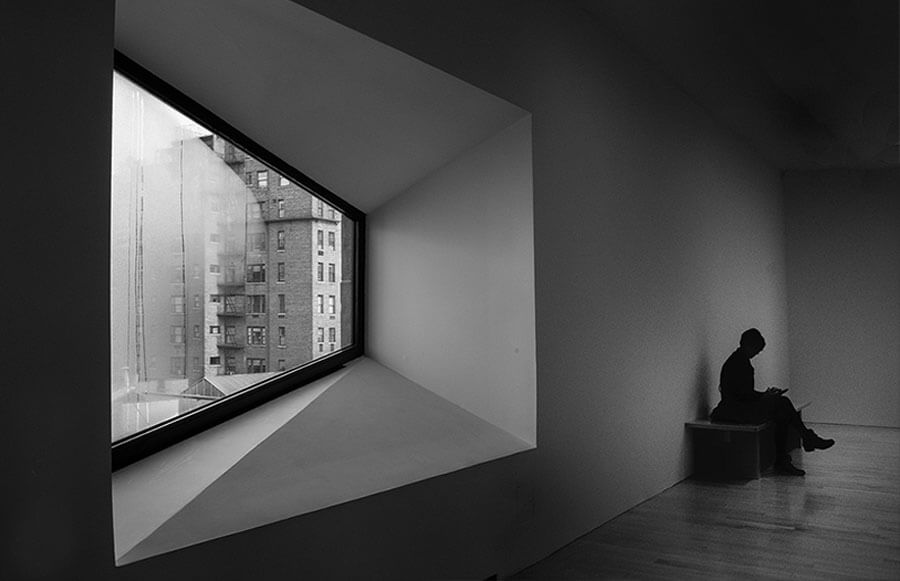
What is your favourite building and why? The Whitney Museum of American Art, in New York by Marcel Breuer. Now known simply as ‘The Met Breuer’ on account of The Whitney moving to its new home in the West Village, the original Upper East Side building designed by Marcel Breuer in 1966 is a hugely significant and bold work of architecture and urban design. Occupying a corner site on Madison Avenue, there is a wonderful sense of drama and scale to Breuer’s design – vast facades clad in granite slabs are cantilevered over one another, with the uppermost volume punctuated by a curious trapezoid window. There is no apology here: this is a work of supreme confidence, a design well ahead of its time. The cantilevered concrete entrance bridge leads into the most extraordinary reception hall – a ceiling of light reflectors, floating benches and slabs of the most beautiful shot-blasted concrete. As you move through the gallery, every detail is a moment to enjoy and the internal spaces are wonderfully controlled with occasional distorted views of the Manhattan streets outside. There is a deliberate and ever-changing sense of light and scale, which lends each room its own distinct atmosphere and identity, whilst the more forgotten corners of the building have been elevated by a rare level of detail. The use of materials is often arresting and unexpected but always combined to great effect. The Met Breuer is not an instantly loveable building – it is challenging and seems to enjoy this confrontation – but to us it represents a high watermark of modernism and there is no place quite like it.
You’ve worked on many private and commercial projects – which is your favourite?
 It’s so hard to say – each project has its own unique challenges and they are all enjoyable in their own way. We derived a huge amount of satisfaction from working on Kew House, an outcome which feels as much like sculpture as architecture with a beautiful composition of internal spaces.
Do you have a favourite quote?
"God is in the details" by Mies van der Rohe – and he’s right…
What is the most satisfying part of being an architect?
We are in the very privileged position of being able to improve people’s lives through the work we do – that is a wonderful thing and a responsibility we are continually mindful of.
How would you describe your design philosophy?William Morris famously declared: ‘Have nothing in your house that you do not know to be useful or believe to be beautiful.’ We think this is a good mantra for designers. We have a duty to make things both functional and beautiful but we also place a strong emphasis on the materiality of our work – experience is as much about sense and touch as it is about light and volume, so the physical and tactile qualities of our work are very important. Above all, good design should be simple and intelligible to everyone and we strive for a purity and simplicity in all we do.
Image 1 & 3: Kew House, by Simone Bossi Image 2: The Met Breuer, by Cornelis Verwaal