Good and bad design surrounds us at any given moment of our lives. Nonetheless, defining each of these can be a complex and subjective process, often with no correct answer. There are certain principles, however, which when applied, allow a space or products form and function to align and offer a frictionless experience.
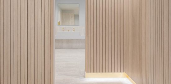 As Dieter Rams states – “The best design is no design”.
Interacting with poorly designed products and spaces multiple times a day has the power to negatively impact your perception of the world around you. (Further reading listed at the end). This is as true of office washroom design, as of any other space or product. Used multiple times per day, addressing a universal need, and an unavoidable part of life, yet on occasion, the design spaces have a vast opportunity to influence your day.
As designers & suppliers of washroom fittings for office projects, we have had the opportunity to work with some of the most talented architects & interior designers in the world on some incredible schemes. Although the aesthetics can be hugely varied depending on the design intent of the scheme, the essence of what makes an enjoyable and intuitive office toilet design is always consistent. Over the course of 15 years we have distilled these key points, which has of course shaped the direction of The Splash Lab and the products we design.
Listed below are 5 design elements we feel make the use of a washroom refreshing, positive & calming whether that be in your office, at the airport, or even in your own home.
• Consistent visual language.
• Consistent use of finishes.
• Intuitive user experience.
• Authentic tactile materials.
• Thoughtful user journey.
Consistent Visual Language
Too often, office washroom spaces are filled with products from varying manufacturers with various design intents, and even if they are all the same finish, the effect can be jarring.
A chunky deck mounted sensor tap next to a wall mounted angular paper towel dispenser, and then moving with dripping hands to a space age looking hand dryer on the opposite wall, is neither pleasant on the eye or calming. Taking the extra time to find manufacturers with design identities that talk to each other, or working with a single manufacturer where possible is always preferable.
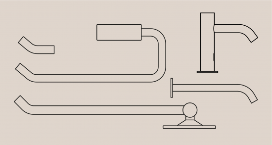 Consistent materials & finishes
Achieving a consistent finish across multiple products in an office washroom is difficult but necessary to create a calming user experience. To achieve this consistency, products with the same base material and coating process must be specified.
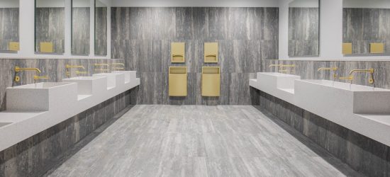 There are several methods for creating a coloured finish, including powder-coating & PVD (Physical Vapour Deposition). Powder coating can work, but we have seen issues with chipping/durability, as it is essentially a paint. Some products, particularly those with multiple parts cannot be powder coated, due to the thickness of the coating, it can create tolerance issues when trying to assemble the parts.
We always recommend PVD as a finish for the following reasons:
• Durability – PVD coating is extremely hard, used across many demanding applications such as firearms and automotive parts.
• Finish Consistency – As with any finishing process, there may be small variations batch to batch, however by controlling the base material, and the PVD process, we are able to retain visual consistency.
• Coating Depth – Due to the coating only being 5 microns thick, it retains the integrity of the brushed steel finish and ensures the product does not lose its sharp edges.
For more on PVD, click here.
Intuitive User Experience
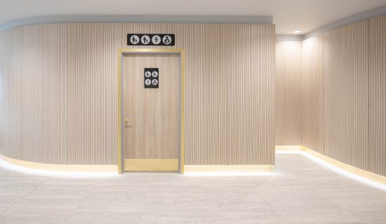 When incorporating a product into an office washroom design, or looking at the space as a whole creating an intuitive user experience is a primary consideration. The user should be in no doubt as to where to go, and how to use the products they encounter. Clear multi-sensory wayfinding can be a key part of this. There are practices out there, who specialise in this area such as Holmes Wood who have some great resources. On the subject of products, its form should always indicate its function. Uncertainty has been proven to play a role in increasing stress levels.
Karate Kid impressions at the sink to trigger off a confusingly shaped dryer, or trigger a soap dispenser does not enhance the user’s washroom experience. This experience is so common to all of us, it has even made its way into pop culture.
Through the use of technology that supports the products function rather than detracting from it, and the use of visual cues, this doesn’t have to be the case!
Authentic & tactile materials
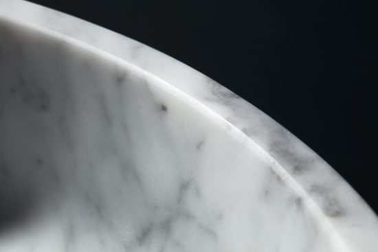 Office washrooms have long been the domain of clinical white & steel designs, and while this aesthetic still absolutely has its place, we feel the use of a warmer CMF palette, such as marble, and bronze and copper fittings can provide a sense of grounding and placement. Bringing a hospitality feel to office washroomss can create a more intimate and welcoming space to rejuvenate during the working day.
Thoughtful User Journey
When planning an office toilet design, the transition through a space and between products is just as important as the individual moments. A trip to the washroom shouldn’t involve squeezing past other people using hand dryers near the exit, or walking the length of the cubicles to try and see if it is engaged or not. In high traffic washroom areas, this point can be particularly acute, not only due to the volume of people, but also those carrying more baggage.
With thoughtful space planning, layouts can be created in such a way that pinch points, and bottle necks for example at the exit, or in the hand washing & drying zones can be eliminated, allowing each person to use the facilities in their own personal space and time. Designing a one-way flow, or even just minimising the number of areas of multi-directional flow is always beneficial.
Summary
In summary, like any other design project, crafting a refreshing washroom experience in yours or your clients office can be pared back to a few key principles, which if executed correctly, regardless of budget can help enhance the user’s interaction with the space.
Any questions or thoughts on the article are most welcome at info@thesplashlab.com.
Further Reading on User Interface & Every Day Design
 As Dieter Rams states – “The best design is no design”.
Interacting with poorly designed products and spaces multiple times a day has the power to negatively impact your perception of the world around you. (Further reading listed at the end). This is as true of office washroom design, as of any other space or product. Used multiple times per day, addressing a universal need, and an unavoidable part of life, yet on occasion, the design spaces have a vast opportunity to influence your day.
As designers & suppliers of washroom fittings for office projects, we have had the opportunity to work with some of the most talented architects & interior designers in the world on some incredible schemes. Although the aesthetics can be hugely varied depending on the design intent of the scheme, the essence of what makes an enjoyable and intuitive office toilet design is always consistent. Over the course of 15 years we have distilled these key points, which has of course shaped the direction of The Splash Lab and the products we design.
Listed below are 5 design elements we feel make the use of a washroom refreshing, positive & calming whether that be in your office, at the airport, or even in your own home.
• Consistent visual language.
• Consistent use of finishes.
• Intuitive user experience.
• Authentic tactile materials.
• Thoughtful user journey.
Consistent Visual Language
Too often, office washroom spaces are filled with products from varying manufacturers with various design intents, and even if they are all the same finish, the effect can be jarring.
A chunky deck mounted sensor tap next to a wall mounted angular paper towel dispenser, and then moving with dripping hands to a space age looking hand dryer on the opposite wall, is neither pleasant on the eye or calming. Taking the extra time to find manufacturers with design identities that talk to each other, or working with a single manufacturer where possible is always preferable.
 Consistent materials & finishes
Achieving a consistent finish across multiple products in an office washroom is difficult but necessary to create a calming user experience. To achieve this consistency, products with the same base material and coating process must be specified.
 There are several methods for creating a coloured finish, including powder-coating & PVD (Physical Vapour Deposition). Powder coating can work, but we have seen issues with chipping/durability, as it is essentially a paint. Some products, particularly those with multiple parts cannot be powder coated, due to the thickness of the coating, it can create tolerance issues when trying to assemble the parts.
We always recommend PVD as a finish for the following reasons:
• Durability – PVD coating is extremely hard, used across many demanding applications such as firearms and automotive parts.
• Finish Consistency – As with any finishing process, there may be small variations batch to batch, however by controlling the base material, and the PVD process, we are able to retain visual consistency.
• Coating Depth – Due to the coating only being 5 microns thick, it retains the integrity of the brushed steel finish and ensures the product does not lose its sharp edges.
For more on PVD, click here.
Intuitive User Experience
 When incorporating a product into an office washroom design, or looking at the space as a whole creating an intuitive user experience is a primary consideration. The user should be in no doubt as to where to go, and how to use the products they encounter. Clear multi-sensory wayfinding can be a key part of this. There are practices out there, who specialise in this area such as Holmes Wood who have some great resources. On the subject of products, its form should always indicate its function. Uncertainty has been proven to play a role in increasing stress levels.
Karate Kid impressions at the sink to trigger off a confusingly shaped dryer, or trigger a soap dispenser does not enhance the user’s washroom experience. This experience is so common to all of us, it has even made its way into pop culture.
Through the use of technology that supports the products function rather than detracting from it, and the use of visual cues, this doesn’t have to be the case!
Authentic & tactile materials
 Office washrooms have long been the domain of clinical white & steel designs, and while this aesthetic still absolutely has its place, we feel the use of a warmer CMF palette, such as marble, and bronze and copper fittings can provide a sense of grounding and placement. Bringing a hospitality feel to office washroomss can create a more intimate and welcoming space to rejuvenate during the working day.
Thoughtful User Journey
When planning an office toilet design, the transition through a space and between products is just as important as the individual moments. A trip to the washroom shouldn’t involve squeezing past other people using hand dryers near the exit, or walking the length of the cubicles to try and see if it is engaged or not. In high traffic washroom areas, this point can be particularly acute, not only due to the volume of people, but also those carrying more baggage.
With thoughtful space planning, layouts can be created in such a way that pinch points, and bottle necks for example at the exit, or in the hand washing & drying zones can be eliminated, allowing each person to use the facilities in their own personal space and time. Designing a one-way flow, or even just minimising the number of areas of multi-directional flow is always beneficial.
Summary
In summary, like any other design project, crafting a refreshing washroom experience in yours or your clients office can be pared back to a few key principles, which if executed correctly, regardless of budget can help enhance the user’s interaction with the space.
Any questions or thoughts on the article are most welcome at info@thesplashlab.com.
Further Reading on User Interface & Every Day Design
Hello World Emotional Design Don’t Make Me Think The Design of Everyday Things