The Splash Lab, working closely alongside McLaren Excell started out by outlining the scope of the brief; to create The Splash Lab's US flagship showroom within a 1930’s factory unit.
We wanted to create something unique that resonated with our passion for design, experience and exploration. We did, however remain open minded as to how this intent might be communicated as a work of architecture.
The space needed to showcase our products, but it was equally important to create a space that echoed with the brands principals – an emphasis on high quality and inventive design, the importance of materiality, and how these can positively contribute to the consumer experience and enhance the brand values. This could only be achieved by developing an environment where the architectural intervention and the tactile qualities of The Splash Lab’s products coexist in harmony, celebrating the coming together of products, materials and architecture, where the presence of each reinforces the other.
Mclaren Excell started with a pragmatic appraisal of the areas required for product display, meeting rooms, staff kitchen, reception area etc. Schematically, we wanted to deviate from the typical showroom format of individual rooms within a larger space – the display areas needed to feel integral to the architecture of the space and not afterthoughts within an independently conceived envelope. The various functions of the showroom are identifiable through a subtle hierarchy of positioning, materiality and product, resulting in a clear understanding of the showroom and what it offers.
 The Design Response:
When approaching the site, Mclaren made the decision to embrace the raw architectural qualities of the existing building whilst creating a distinctive identity for The Splash Lab. The felt it was key to explore how the core activity of The Splash Lab – namely ritual purification and cleansing - could provide a compelling and prosaic setting for the display and marketing of their wares.
Mclaren decided to introduce a series of monumental insertions that would create an evocative user experience, whilst establishing a clear spatial hierarchy to the unit. The design needed to have enough tactility to lend it the weight and presence necessary to establish this identity but without competing with the existing building fabric.
There was a visual disconnect between the entrance area and the main gallery due to the amended layout of the building - the visual axis had been broken. Re-establishing this axis became a key consideration in developing the concept of the space. Mclaren felt strongly that the axis should result in a moment of revelation, the start of a journey through the space and the returning point of orientation.
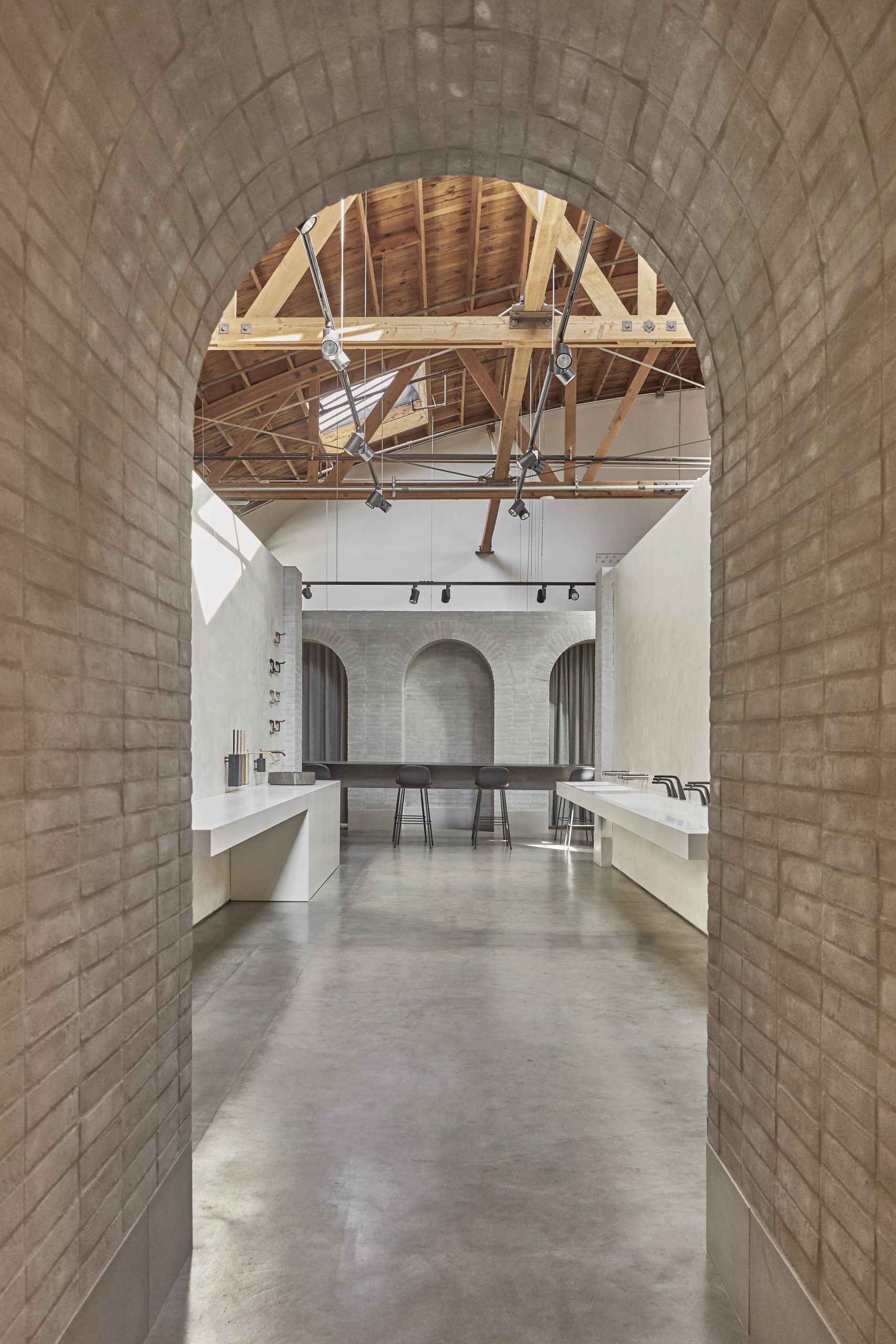
There are four monumental interventions establishing six distinct areas, each separated by a large archway. The entrance ‘portal’ arch marks the start of the journey, and is the transition from the entrance area into the gallery. It is positioned to obscure the visual axis until the moment of entering the gallery. The archways align themselves along the axis and suggest a theme of spirituality and ritual cleansing.
Much like a church or cathedral, the monumental interventions establish a simple structuring to the space. To continue the analogy, from the narthex you enter a central nave which is flanked by two side aisles. There is a transcept with a sculptural steel table as the central altar, which is intended to encourage participation through interactive displays and formal seminars.
A triple-arched apse provides the axial focal point and marks the end of journey, while a screen divides the public areas of showroom ‘worship’ from the private area of the staff ‘choir’ – or, in this instance, meeting rooms – helping to establish a clear threshold between public and private spaces. This simple and timeless format provides the setting for showcasing The Splash Lab, and evokes a sense of spirituality and personal ritual, heightening the user's experience and imbuing the products with a degree of gravitas.


 The Design Description:
As a practice, Mclaren enjoy working with materials that are natural, tactile and have great wearing properties. The muted palette of materials has been selected with the intention of allowing the user to better appreciate the qualities of light, proportion and surface while allowing our products to take centre stage. Exploration of the tectonic relationships between materials, and experimenting with surfaces textures have become an important focus of our material approach.
To enhance the monumental appearance of the insertions we opted for a Danish format brick with a German ‘Ziegal Geschlammt’ mortar application - meaning ‘covered’ or ‘heavy coverage’. This process blurs the unit rhythm of the bricks to create a monolithic surface. A concrete plinth allows the brick structures to appear grounded gives the sense that they have always been founded on the existing concrete floor, and there is enjoyment in the relationship between rough (permanent) brickwork of the structure and the smooth (temporary) plaster of the display backdrops.
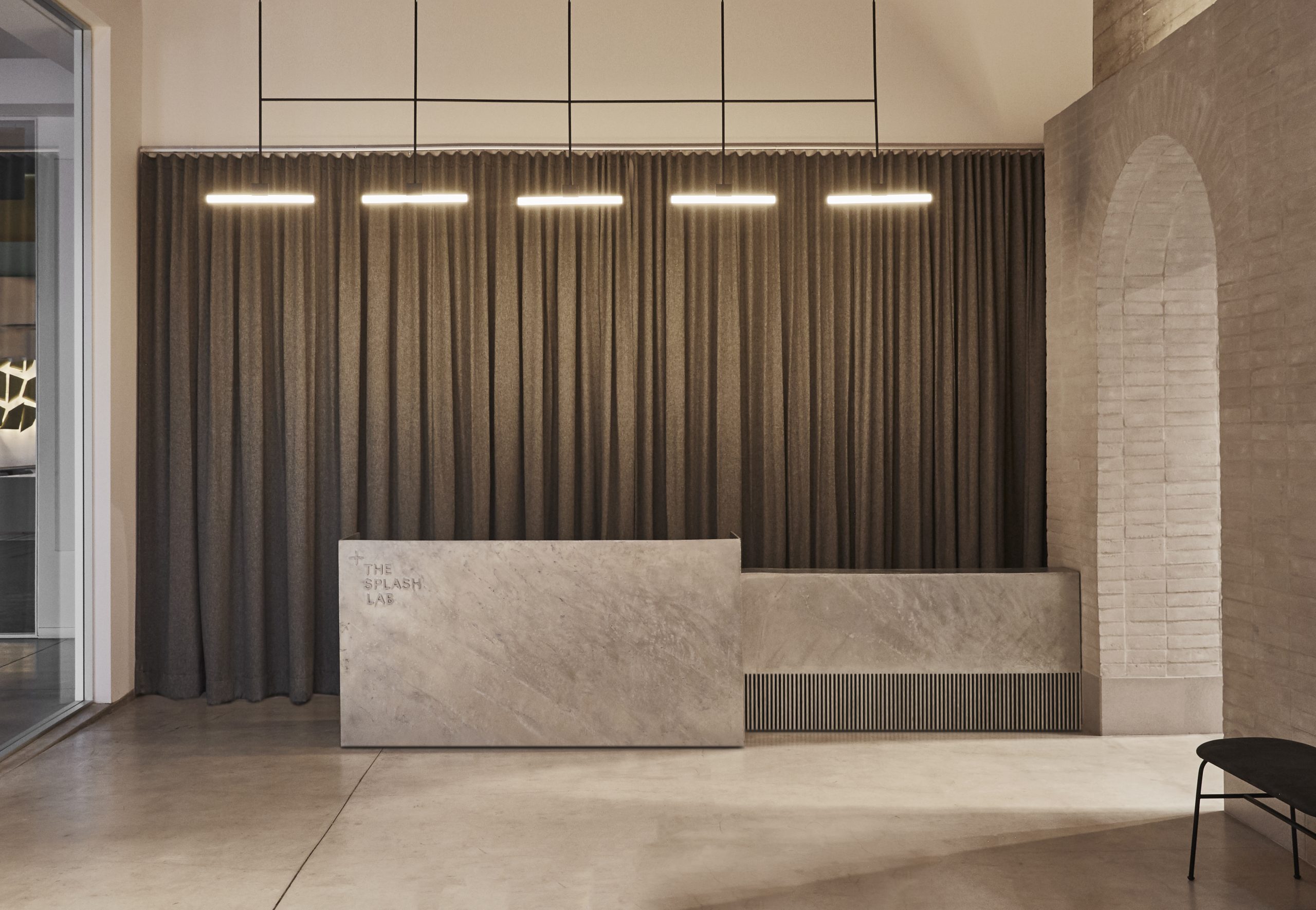
The curtains in the entrance hall were chosen to be as a soft counterpoint to the hard surfaces, but also for their inherent sense of drama; they also allow the space to remain flexible so that displays can be concealed and revealed as required.
The hot dip galvanizing process used for reception desk enables it to sit as a stand-alone object, immediately drawing the attention of anyone who enters the showroom.
The use of materials in the four display niches became an important consideration - we did not want to fall into the trap of re-creating a domestic bathroom setting for the products. The material choice for each of these display areas subtly signifies the kinds of applications and environments in which the products are likely to be used.
White oiled oak joinery elements have been introduced into the meeting rooms and certain display areas help lend a human scale to points of customer interaction.

 Overall, Mclaren worked to create a showroom that embraced the existing raw architectural qualities of the location, optimising the space to highlight the varying products within The Splash Labs range, and ensuring that the experience flows for all visitors through our ranges whilst in-keeping with our core values.
We believe, the design has been a huge success, from the moment the client steps in through the door, through to each product display, revealing the key concepts of the washroom and how, at The Splash Lab, we believe that designing inclusive bathrooms: Its more than just changing the sign.
Washrooms are the most used spaces, but the least considered. We're changing that; and this is displayed in our showrooms, introducing new design concepts, revealing how crucial it is to endorse customer experience in the washroom, and inspire creativity in the workplace, increasing creative thoughts using solitude and distraction free design.


 The Design Response:
When approaching the site, Mclaren made the decision to embrace the raw architectural qualities of the existing building whilst creating a distinctive identity for The Splash Lab. The felt it was key to explore how the core activity of The Splash Lab – namely ritual purification and cleansing - could provide a compelling and prosaic setting for the display and marketing of their wares.
Mclaren decided to introduce a series of monumental insertions that would create an evocative user experience, whilst establishing a clear spatial hierarchy to the unit. The design needed to have enough tactility to lend it the weight and presence necessary to establish this identity but without competing with the existing building fabric.
There was a visual disconnect between the entrance area and the main gallery due to the amended layout of the building - the visual axis had been broken. Re-establishing this axis became a key consideration in developing the concept of the space. Mclaren felt strongly that the axis should result in a moment of revelation, the start of a journey through the space and the returning point of orientation.
There are four monumental interventions establishing six distinct areas, each separated by a large archway. The entrance ‘portal’ arch marks the start of the journey, and is the transition from the entrance area into the gallery. It is positioned to obscure the visual axis until the moment of entering the gallery. The archways align themselves along the axis and suggest a theme of spirituality and ritual cleansing.
Much like a church or cathedral, the monumental interventions establish a simple structuring to the space. To continue the analogy, from the narthex you enter a central nave which is flanked by two side aisles. There is a transcept with a sculptural steel table as the central altar, which is intended to encourage participation through interactive displays and formal seminars.
A triple-arched apse provides the axial focal point and marks the end of journey, while a screen divides the public areas of showroom ‘worship’ from the private area of the staff ‘choir’ – or, in this instance, meeting rooms – helping to establish a clear threshold between public and private spaces. This simple and timeless format provides the setting for showcasing The Splash Lab, and evokes a sense of spirituality and personal ritual, heightening the user's experience and imbuing the products with a degree of gravitas.


 The Design Description:
As a practice, Mclaren enjoy working with materials that are natural, tactile and have great wearing properties. The muted palette of materials has been selected with the intention of allowing the user to better appreciate the qualities of light, proportion and surface while allowing our products to take centre stage. Exploration of the tectonic relationships between materials, and experimenting with surfaces textures have become an important focus of our material approach.
To enhance the monumental appearance of the insertions we opted for a Danish format brick with a German ‘Ziegal Geschlammt’ mortar application - meaning ‘covered’ or ‘heavy coverage’. This process blurs the unit rhythm of the bricks to create a monolithic surface. A concrete plinth allows the brick structures to appear grounded gives the sense that they have always been founded on the existing concrete floor, and there is enjoyment in the relationship between rough (permanent) brickwork of the structure and the smooth (temporary) plaster of the display backdrops.
The curtains in the entrance hall were chosen to be as a soft counterpoint to the hard surfaces, but also for their inherent sense of drama; they also allow the space to remain flexible so that displays can be concealed and revealed as required.
The hot dip galvanizing process used for reception desk enables it to sit as a stand-alone object, immediately drawing the attention of anyone who enters the showroom.
The use of materials in the four display niches became an important consideration - we did not want to fall into the trap of re-creating a domestic bathroom setting for the products. The material choice for each of these display areas subtly signifies the kinds of applications and environments in which the products are likely to be used.
White oiled oak joinery elements have been introduced into the meeting rooms and certain display areas help lend a human scale to points of customer interaction.

 Overall, Mclaren worked to create a showroom that embraced the existing raw architectural qualities of the location, optimising the space to highlight the varying products within The Splash Labs range, and ensuring that the experience flows for all visitors through our ranges whilst in-keeping with our core values.
We believe, the design has been a huge success, from the moment the client steps in through the door, through to each product display, revealing the key concepts of the washroom and how, at The Splash Lab, we believe that designing inclusive bathrooms: Its more than just changing the sign.
Washrooms are the most used spaces, but the least considered. We're changing that; and this is displayed in our showrooms, introducing new design concepts, revealing how crucial it is to endorse customer experience in the washroom, and inspire creativity in the workplace, increasing creative thoughts using solitude and distraction free design.


